Businesses need real-time insights to respond & adapt to operational performance swiftly. Be it changes in customer purchase patterns or market conditions. The interactive dashboards display visual analytics, KPIs, trends, and spot anomalies in real-time. Yet, designing these dashboards that balance accuracy, usability, and cost-efficiency remains a challenge. If not designed well, dashboards may bombard users with information. Rather than helping them make intelligent decisions. This is where interactive Microsoft Power BI dashboards stand out. It empowers you to transform static visuals into intuitive tools for exploration. Thus, simplifying data understanding and intelligent decision-making.
A Power BI dashboard is one page that displays many types of charts and visuals. They are all designed to explore and interact with your data easily. But how to build a dashboard that combines visual clarity with real business impact? It’s not an easy job to design an interactive dashboard that shows data and encourages intelligent decision-making. We’re here to simplify the process. In this blog, we’ll discuss a few steps for designing Power BI dashboards. How our data scientists have helped businesses with Power Automate and Power BI.
What is Power BI? How to Create Interactive Dashboards?
According to Microsoft, Power BI “is a collection of software services, apps, and connectors that work together. They turn your unrelated sources of data into coherent, visually immersive, and interactive insights.” In other words, Power BI interactive dashboard lets users connect to various data sources. It can be an Excel spreadsheet or a collection of cloud-based and on-premises hybrid data warehouses. Users can transform raw data into meaningful insights and share them with others in an easy-to-understand format. They can be interactive dashboards, reports, and other visualization methods.
Power BI Interactive Dashboard Real-World Applications
Businesses across industries use interactive dashboards to visualize their crucial data. Some of the prominent use cases of Power BI dashboards are: Guide to Building Power BI Interactive Dashboards
1: Customer Profitability Dashboard
Power BI can be used to analyze customers’ profitability ratios. It’s a key metrics that help business executives analyze the charts and tables more appropriately and then make decisions based on the details. The dashboard displays all the product details, gross margins, and total revenues to help them better understand the customer behaviour or purchase history.
2: Sales and Marketing Dashboard
This is one of the most popular applications of Power BI dashboards: helping businesses gain insight into their market shares, product sales volume, and product pricing techniques. It also helps them forecast sales and identify missed opportunities.
3: Human Resources Dashboard
These interactive Power BI dashboards let businesses get information and keep records of several aspects of onboarding or employee engagement. Key metrics include new hires, resigned employees, and active employees. By offering a central database and platform to track employees, these dashboards automate HR tasks, freeing employees to focus on other business operations and increasing overall efficiency.
4: Inventory Analysis Dashboard
Power BI interactive dashboard allows businesses to track inventory orders and stock and monitor the manufacturing of a product line, ensuring that they do not face any issues in their work. Such a level of efficiency and automation simplifies supply chain management, equipping the company with resources and letting it reinstate focus on strategies to increase profitability.
Things to Consider Before Developing a Power BI Dashboard
Here are some of the key questions to ask yourself before moving into the implementation of your Power BI interactive dashboard:

- Who are the dashboard’s end users? Every dashboard has its users, and these users have distinct expectations. For instance, executives might prefer an overview of key metrics, while analysts may require in-depth data exploration. To accommodate diverse needs, consider tailoring separate dashboards for each audience.
- What are the dashboard’s primary goals? Understanding the purpose of the Power BI dashboard is crucial. By identifying the key issues it should address, you can stay focused and goal-oriented. For example, beyond total volume, it could highlight top-performing products, most profitable regions, and evolving trends over time.
- Who will manage its design and implementation? Does your team have expertise in Power BI? Many businesses collaborate with data specialists like us to ensure a seamless, optimized dashboard while avoiding common challenges.
- How will data impact the dashboard? Your dashboard is only as valuable as the data it presents, making its integrity and management essential for meaningful business outcomes. High-quality data ensures reliable decision-making, while well-structured datasets improve usability and efficiency.
After thoroughly considering these factors, let’s shift our focus to understanding how to create a Power BI Dashboard that will empower you to make informed decisions and drive better decision-making.
Also Read: Free vs. Pro vs. Premium Vs. Embedded Power BI Services
Step-By-Step Guide on How to Create a Power BI Dashboard
We cannot emphasize enough the significance of interactive dashboards for businesses. They not only help leaders share, understand, or collaborate on shared information or data, but interactive Power BI dashboards also enable them to monitor business and see all the most important metrics (processes, customers, sales, and operations) at a glance. Here we are sharing a few steps to show how successfully you can build Power BI Dashboards:
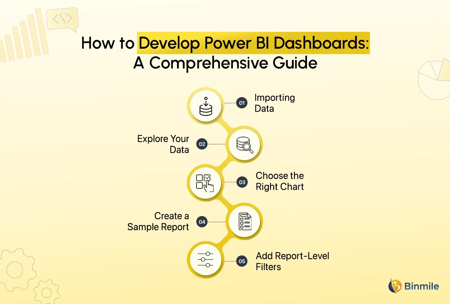
Step 1: Importing Data
Connect Power BI to various data sources to pull data from Excel spreadsheets, SQL Server databases, or even web-based platforms. Ensure the data is clean before loading, including removing unneeded elements from columns, handling missing data points’ values, and correcting the format.
- After launching Power BI Desktop, move to the Home tab in the interface.
- Select Get Data.
- Navigate to open your data source from the available options (such as Excel, CSV, and SQL Server). Then choose your desired file or server location.
- When you select a data source, Power BI shows your table previews. Select all data tables you wish to import.
Step 2: Explore Your Data
Effective visualization and reporting depend on a thorough examination of your data structure and content. Identifying key metrics combined with a clear definition of desired outcomes makes your data modelling process more efficient.
- Switch to “Data view” to view your database tables alongside their columns.
- Check for relationships between tables. Multiple-table datasets require you to define logical connections from the Model view perspective.
- Using the “Field” pane allows you to filter, sort, and explore how different data points relate to each other.
Step 3: Choose the Right Chart
Create visuals that best represent the story you want to tell. However, don’t overcrowd your dashboard with too many different types of charts. Focus on clarity and simplicity. When interpreting data, select a chart that ensures easy understanding (bar charts compare values, and lines show trends) over just visually appealing elements.
- To begin visualizing data, users must open the Report view.
- Use the Visualizations pane to choose a chart type that matches your analytical requirements.
- Drag relevant fields into the appropriate chart areas (for example, place Revenue in the Values field and Month in the Axis).
Step 4: Create a Sample Report
Build your report and its visuals so that they don’t confuse your users with data representations that they cannot analyze. The report should have an easy-to-follow structure and layout that avoids dense or hard-to-understand visual content for readers.
- Each report page must contain multiple visual representations, each demonstrating a unique aspect of the story.
- Present different visualizations in a clean layout. This can be done through Power BI’s feature to resize and position visuals for a neat presentation.
- Add context-related text boxes, which function as titles or explanations to improve reader understanding.
Step 5: Add Report-Level Filters
Report filters allow you to extract relevant information from extensive datasets that can then be effectively displayed through reports or dashboards. This improves usability, as users can focus on data points that are relevant to them.
- In the Visualizations pane, locate the Filters section.
- You can drag and drop your essential fields (such as Region or Product Category) into the Filters on this report area.
- Edit your report filters so they affect single elements or the whole document, depending on your defined interaction scope.
Business Use Case: Empowering Retail Finance Operations with Power BI
One of our most impactful implementations of Power BI was for a large retail client facing challenges in managing debt collection and financial tracking. We developed a comprehensive interactive finance dashboard, now serving as a centralized platform for multiple business functions, especially around payment collection and financial management.


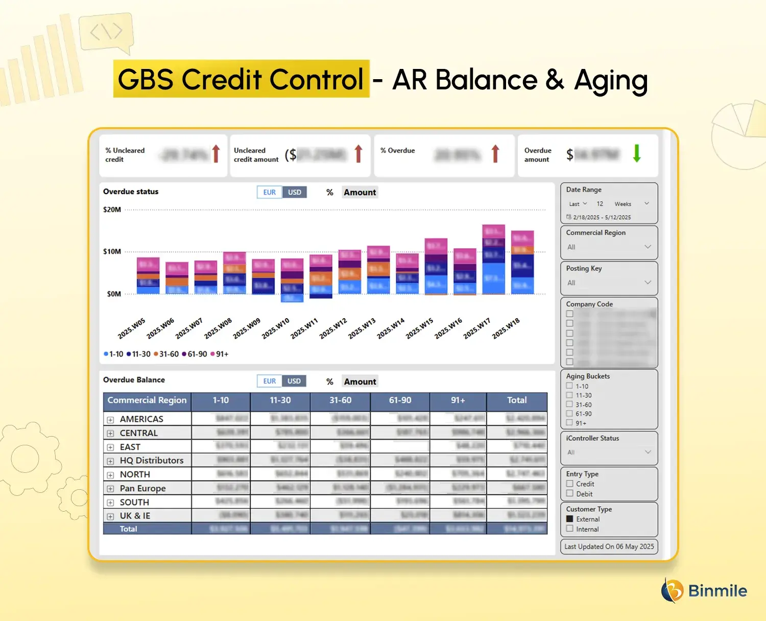
- Finance Module with Broad Applicability: Initially designed for retail, this module suits any business where payment collection is critical. It’s especially effective for companies struggling with bad debt or delayed payments.
- Rule-Based Financial Reporting: We built rule-driven reports to track sales cycles, identify outliers, monitor payment delays, and spot expiration risks —all in real-time.
- Live Data Sync & Integration: The dashboard integrates seamlessly with SQL Server, SharePoint, Microsoft Excel, and Power BI, ensuring up-to-date and synchronized reporting.
- Automation & Intelligence: Power Automate was used to capture vendor payment details with precision. Automated business rules help interpret data patterns and guide actions, letting the data “speak” for itself.
- Advanced BI Tools & Features: Utilized Power Query, Power View, Power Map, and DAX to build a real-time database and dynamic visual reports. Created multi-filter models and support for multiple entry types, allowing for deep drilldowns and customized views.
- Low-Code/No-Code Efficiency: The solution was built using a low-code/no-code approach, making it scalable and maintainable with minimal technical effort.
- Results and Applicability: The final solution acts not just as a dashboard, but as a platform for insight and action, ideal for sectors beyond retail, including healthcare, hospitality, and home health. Key outputs include – Debt Collection Reports, Credit Control Dashboards, and Aging Analysis Report.
Also Read: Power BI Managed Services for Data Analysis
Closing Statement
Undoubtedly, Power BI has many features and benefits for businesses looking to make intelligent, data-driven decisions. However, creating interactive dashboards in Power BI is more than simply throwing a few filters, buttons, or charts at it. Your intention should be to build a visually appealing but highly informative centralized system that intuitively provides insights that are meaningful, understandable, and, most importantly, actionable.
Hopefully, this blog has given you the proper insight into how to build a Power BI interactive dashboard efficiently. If the process feels overwhelming, it may be wise to leverage external data engineering services. If the steps seem too overwhelming, we recommend that you seek external assistance and avoid creating dashboards that offer incorrect or incomplete information. Their Power BI developers specialize in transforming raw business data into interactive dashboards and rich visuals, thus enabling businesses to make informed decisions, quickly and accurately.